In-Person Marketplace Enrollment Efforts in North Carolina
Project Synopsis

Health insurance navigators provide valuable in-person assistance to individuals who are trying to understand the health insurance options provided through the Federally Facilitated Marketplace and Medicaid. The NC Navigator Consortium is a network of Navigators in North Carolina, led by Legal Aid of North Carolina, that provides outreach, educational, and assistance events, targeting communities that have historically experienced lower access to affordable health insurance coverage. This project uses data visualizations to depict enrollment rates and assister events to help Navigators like those in the NC Navigator Consortium plan future assister events.
About the Dashboard
This dashboard was funded by the Kate B. Reynolds Charitable Trust and built through partnership with the NC Navigator Consortium. It provides insight into changing enrollment rates across North Carolina. Navigators and their partners may use this dashboard to identify counties with high rates of unenrolled individuals who are eligible to purchase health insurance through the Marketplace and, in doing so, better target outreach events accordingly.
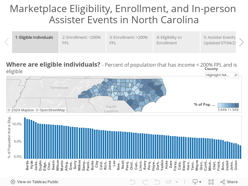
Figure Descriptions
Figure 1: This map and bar chart visualize the percent of the population in each county in 2022 that has income <200% of the federal poverty level (FPL) and is eligible for enrollment in health insurance through the Marketplace. Darker blue counties have higher estimated rates of eligible individuals per capita.
Figure 2: This map and bar chart show the percent of estimated eligibles with incomes <200% FPL enrolled in health insurance through the Marketplace in 2022. Darker blue counties in this map have higher rates of enrollment.
Figure 3: This map and bar chart show the percent of estimated eligibles with incomes >200% FPL enrolled in health insurance through the Marketplace in 2022. Darker blue counties have higher rates of enrollment.
Figure 4: This scatter plot combines data presented in Figures 1 and 2, demonstrating the relationship between eligibility rates (percent of the population that is eligible) and enrollment rates (percent of estimated eligibles with incomes <200% FPL that are enrolled). Each county is represented with a circle that is proportional to the estimated number of individuals with incomes <200% FPL who are eligible to enroll through the Marketplace. The color of the circle indicates the rurality of the county (urban, regional city/suburban, or rural). In general, the relationship between eligibility rate and enrollment rate is negative. Counties with enrollment rates that are higher than expected, given their estimated eligibility rate, are considered high performers. (For example, Dare county – the small, green dot in the top center of the figure – has an enrollment rate that is higher than other counties with a similar rate of eligibility.)
Figure 5: This map presents locations of NC Navigator Consortium assister events since August 2021. The base layer map is the same as Figure 2 (displaying the percent of estimated eligibles with incomes <200% FPL enrolled in health insurance through the Marketplace; darker blue indicates higher enrollment rates). Each dot represents an event location and are colored based on the event type (education, enrollment, outreach, and partner meetings).
About the Data
We calculated the enrollment rates using county-level 2022 open enrollment period enrollment data, publicly available from CMS. The enrollment rate denominator is estimated number of eligible individuals, calculated using county-level demographic information from the 2020 American Community Survey, and methods described in previous research. NC Navigator Consortium provides assister event data.
Note(s):
- The mapped events represent a fraction of the total assister activities conducted by the NC Navigator Consortium. Events not reported to the Consortium are not mapped. Importantly many assister events in 2021 and 2022 were virtual due to the COVID-19 pandemic. This dashboard only presents in-person events. Additionally, some event addresses were not able to be converted to coordinates for mapping. Future planned events are included in this dashboard. Additional event data will be included every couple of weeks.
- The CMS data suppressed Marketplace enrollment counts less than or equal to 10. For this analysis we assume these values are all equal to 5. Additionally, we assumed all those that listed their income group as “other” were >200% FPL, based on a note in the data dictionary that indicated that one reason for the “other” FPL, category is that perspective consumers not looking for financial assistance were not required to provide their financial information.
You must be logged in to post a comment.